Block Print
"The Good"
15.24cm x 22.86cm
Ink on paper
October, 2016
15.24cm x 22.86cm
Ink on paper
October, 2016
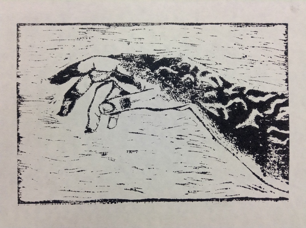
Block Print is another first of mine; I attempted to make this something with more of a meaning than my digital collage. I focused mainly on just having a meaning, while still trying to make it visually appealing. To do this, and because of the extreme similarity of the two, I decided to sort of connect my Block Print and Dry Point. I used the Creation of Adam as inspiration help connect the two. The Good focuses on the good side (nature) of the overall message of man vs nature and mankind's effect on the world.
Inspirational Artist/Work
My inspiration was not from any sort of planned method, I did not do any research to find an artist or any type of picture to base the work off of. I was inspired by one image in particular (Preservation) that I accidentally stumbled upon late in September, 2016. This image is made by a man called “ShortCircuit123” whose real name is Paul, from Netherlands. ShortCircuit123 is Paul’s username for a website (DeviantArt) in which some artists post their own photo-manipulations and digital art. I saw Paul’s piece called “Preservation” and I instantly fell in love with the amount of detail used and the message of the work that needs no words and so strongly speaks for itself. I looked more at Paul’s work and I really enjoyed the use of detail and all his work strongly resembled another one of my favorite movements, Surrealism. I decided that I would want to attempt to give my piece that bit of surrealism as well.
Brainstorming
|
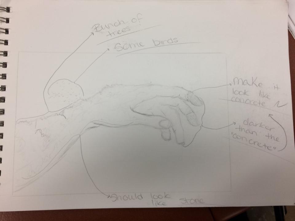
I first drew the hand I was going to carve. I made sure I labeled what I'm aiming for those textures to look like/resemble. Just writing these down instead of drawing them is usually good enough for me to work.
|
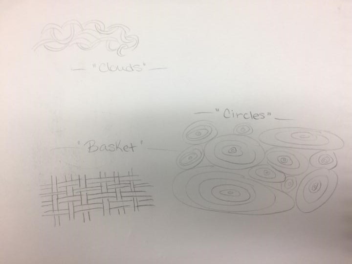
After having the hand drawn and the basic texture ideas for parts of the hand; I started thinking about what type of background I would have. So I quickly drew multiple options for me to compare with each other and make my final decision.
|
Process
- Choosing the Half- Because I wanted to make the connection between my Dry Point and Block Print, I knew and decided that I wouldn't fit both of the hands in the image onto one piece. So I made sure that each image would have only one of the hands by cropping out whichever hand was not going to be on that specific piece. For my block print I decided I would use the hand that is covered in trees. I chose this hand because I felt the "industrial" hand needed more detailed work, so I saved that hand for my Dry Point which I was sure would be a lot easier to get the details in.
- Drawing- Next was one of the most simple steps; drawing the image onto the piece. All I did was just simply draw the "nature" hand onto the piece using a pencil and making sure I had drawn the details I'd be carving later on there as well.
- Choosing a Background- I didn't want to copy the exact image as Paul has created. I am already doing a lot of what he did, so I knew that the background needed to be different at least. In the original image you can see clouds in the background, I wanted to give my background the same feeling as the clouds do. So I attempted to use a combination of wavy lines to create a sort of "windy" texture. I think this step turned out pretty well.
- Outlining- After creating the background and before going into the detailed work, I made sure that I carved out the basic outlining of the hand and the trees. No details, just outlines.
- Adding Texture- I still had one more thing to do before adding the details, I had to create some form of texture onto the hand. I did this mainly on the fingers of the hand and small amount in the tree areas. I made sure to carve a lot lighter in the ares that may be darker than other areas. For example; I carved very small amount on the forearm compared to how much I carved onto the thumb nail.
- Details- Now I was finally able to add the details in the necessary places, like the trees and the two finger tips along with the back of the hand where the rocks are. In Paul's image you can see a flock of birds flying out from the trees towards the top left corner, I did try to re-create those same birds but I found it too difficult no matter how many attempts I made. I just could not get it to look like any sort of birds, I improvised and decided to Leave the birds out of my piece instead and use that area for more background texture.
- Touching Up- After a lot of carving and creating a lot of rough areas, I went back to do a little bit of "touching up" and smoothen out the curves and textures as much as I could.
- Inking- Now it was time to ink the print. After spreading the ink onto a metal tray in a thin layer and covering a roller in ink; I had to use the roller and roll over the piece until I have the top layers covered in ink.
- Printing- Finally, now that the piece is covered in ink, I place a piece of paper on top of the print and apply pressure in a circular motion to transfer the ink. Some of the results did not turn out quite right, either too much ink or too little, so multiple trials were needed.
Reflection
I am actually more pleased with my piece than I thought I’d be. Before I began I thought carving would be a lot easier than what it actually was, I thought that I would have no problem getting a decent amount of detail. Although, when I began and actually started the carving process, I realized how difficult it’s going to be getting the detail I’d want to really give it that surrealism. From that point I came to the conclusion that I would be so displeased with the results. I was wrong. I am really proud of the detail I got even though it’s not what I had in mind in the beginning. I am also proud of how well I got the proportions down for the fingers and thumbs and even trees. Along with how well I feel overall about the piece, I am a little disappointed with the fact I could not manage to get the birds into the final piece.
ACT Connections
- Clearly explain how you are able to identify the cause-effect relationship between your inspiration and its effect upon your artwork. ShortCircuit123, or Paul, had am overwhelming amount of detail in every single one of his pieces, and detail and Surrealism were two main objectives of mine for my Block Print. This shows how Paul's work helped me set the goals I wanted for this project.
- What is the overall approach the author has regarding the topic of your inspiration? I think that Paul definitely notices the problems of damage to nature from man. I think that he used this topic to create a piece that needed no words to express the message to others.
- What kind of generalizations and conclusions have you discovered about people, ideas, cultures, etc. while you researched your inspiration? One conclusion I made was that a lot of people really do overlook the damage caused to nature by man. Also how no one is actually paying any attention to some major problems unless something, like a picture, makes them realizes the reality of the issue.
- What was the central idea or theme around your inspirational research? As mentioned in my answer for question 1, two of my main goals for my block print as details and surrealism. DeviantArt is a website I knew contained a lot of very detailed pieces of work from many artists, I decided that's where I'd look for a "detailed/surrealist" artist.
- What kind of inferences did you make while reading your research?
