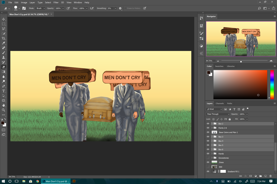
DIGITAL PAINTING
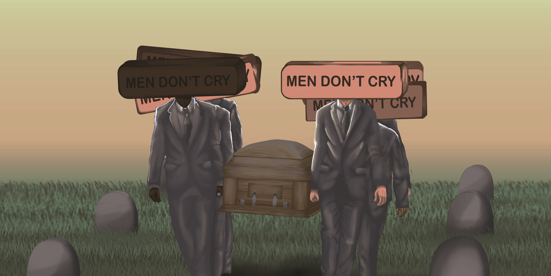
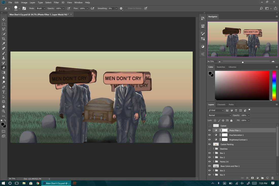
Men Don't Cry
47.74cm x 23.89cm
Digital Painting on Photoshop
October, 2017
47.74cm x 23.89cm
Digital Painting on Photoshop
October, 2017
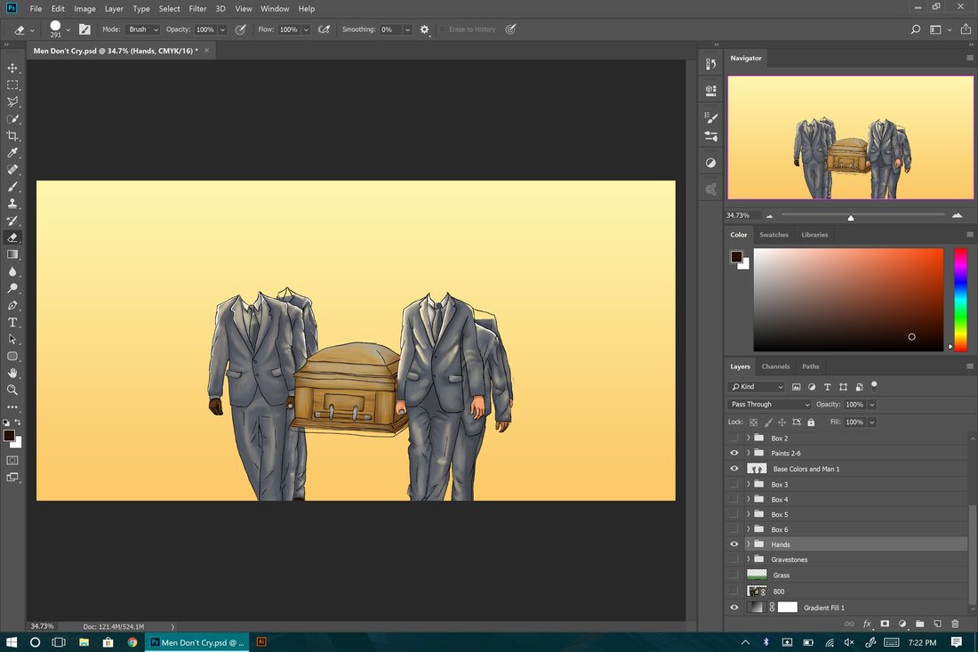
As a lot of men might know from experience; we've been told all the time that because we're men we don't cry, that if we cry we're not a "real" man. This inspired me to digitally paint an image that is commonly a sad or cry worthy scene/event, although instead of seeing the men's crying faces you see a big block that just says "MEN DON'T CRY" on every man. Just as Banksy puts the message in the open when emphasis I too used that same concept and placed the words out there in the open. The blocks show how the men in this image would be emotionless just as a man would be if he never cried just because he is "real" man. The variety of skin tones and height are my attempt at making the piece relatable to all men and not just one group.
Inspirational Artist/Work
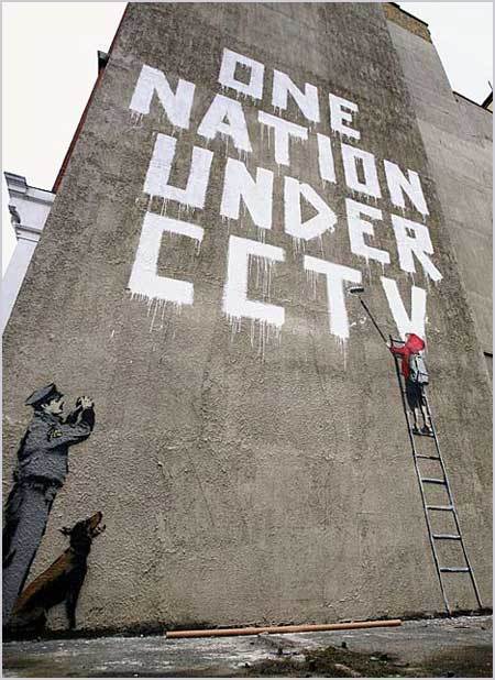
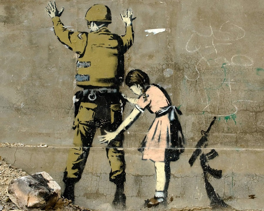
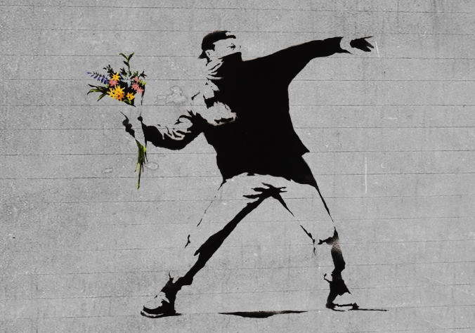
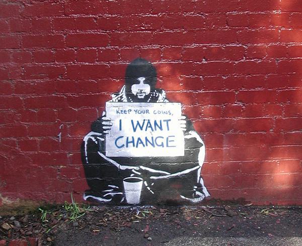
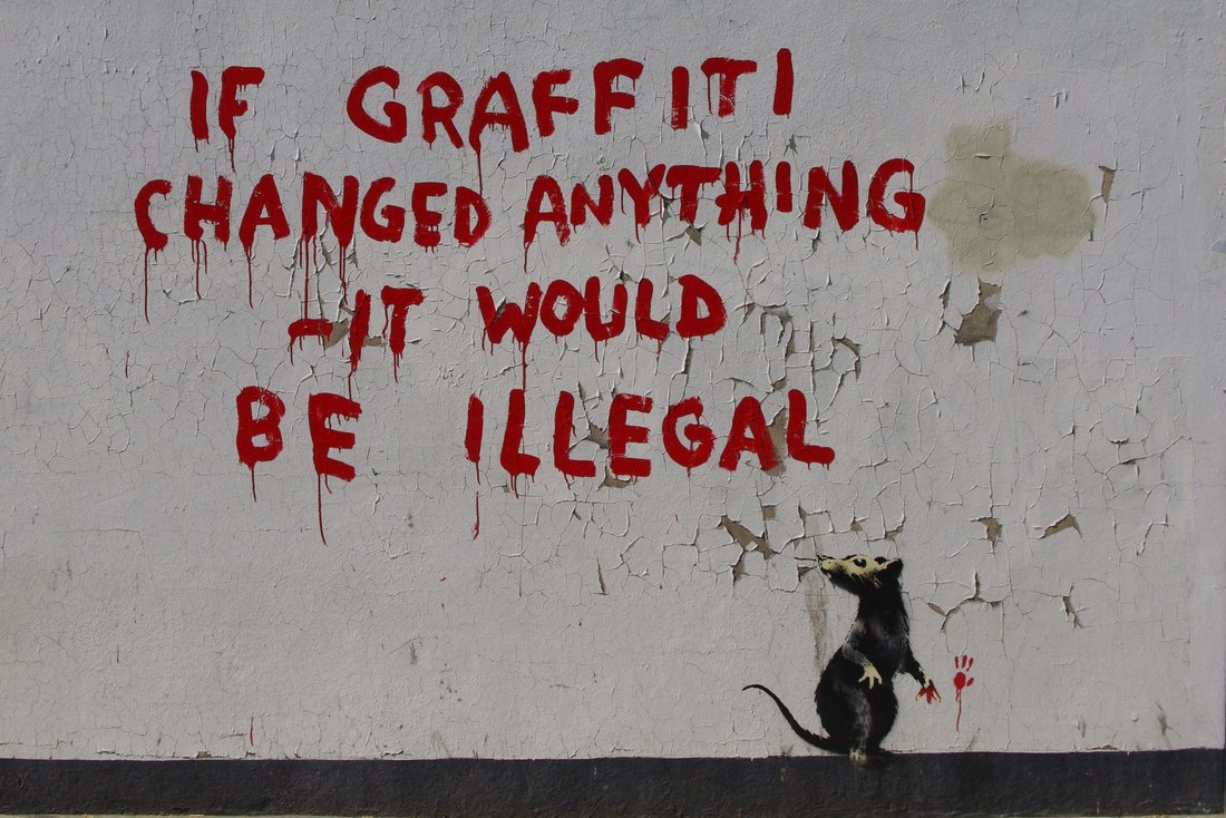
--- Banksy ---
|
Although no one knows his real name, Banksy often creates pieces that are inspirational but also controversial and provoking. What makes his work so controversial is the fact that they’re are mostly based off of modern day problems and struggles and uses the subjects to provoke emotion and thought into his audience. He often displayed these subjects and pieces on the side of buildings with a large scale so that they were not easy to miss. This played along with the actual pieces themselves to make his work so popular and thought provoking. This part of his work that's so out there and controversial and sensitive subjects is exactly what makes him so inspirational for my work. This same exact aspect is what I planned to bring into my work.
|
|
Brainstorming
Process/Experimentation
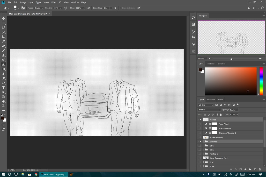
- Sketching- Just like any other drawing or painting, I began the process with a basic sketch. I used a stock photo as reference and was able to get the basic shapes I need for the suits and casket as I knew I would be free-handing everything else.
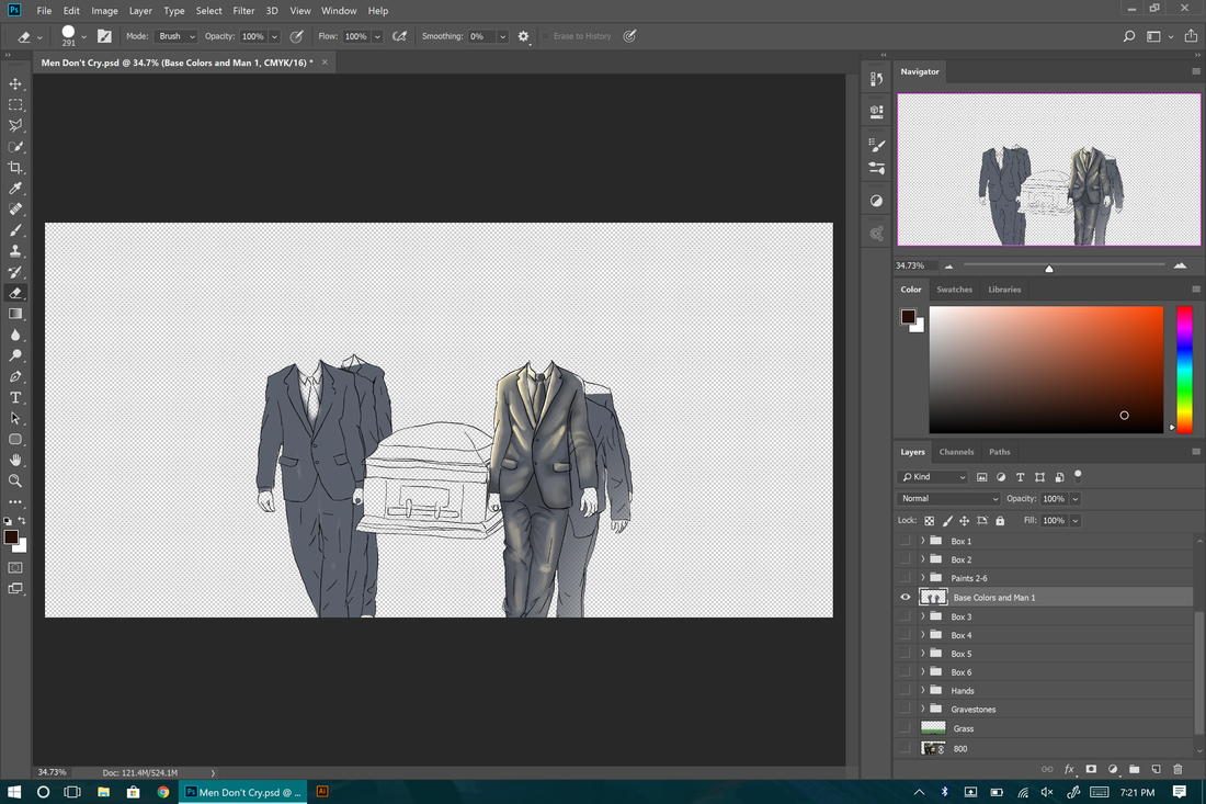
- Base Colors and First Man- After the sketch I used the brush tool to paint the basic tone/ color I would be using for all the suits. Also, I accidentally painted the lighting and details for the first man on the same layer instead of a separate layer like I planned to do in step 3.
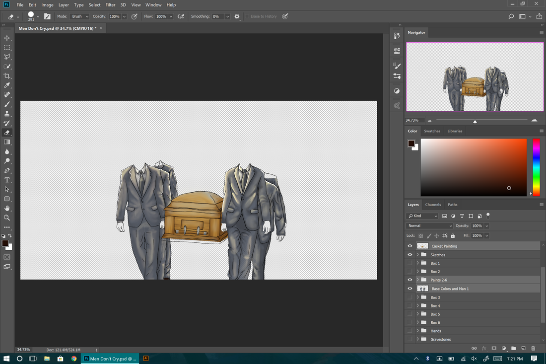
- Details on Men and Casket- This time I painted the lighting and details on each of the suit's on separate layers. For this part I continued the brush tool but varying my softness of the brush and the opaqueness of certain colors and lighting.
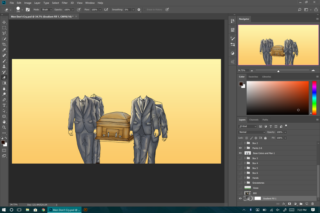
- Gradient / Background- At this point I realized that I made the mistake of painting the lighting on the men without figuring out what type of lighting it would and what type of lighting I should use to better express the tone and mood of the piece in it's whole. Without thinking I went straight towards the midday sunny look and decided it wasn't worth my time to backtrack that far and start over with the lighting so I decided to lay down a background / sky to match the lighting and plan to fix the mood later on.
- Hands- I then decided it was time for me to move on to the actual flesh parts of the men like there hands and necks/"box heads". I painted the hands first with the shadows from the suits and everything but I also made sure to provide more than just one skin tone/ ethnicity so that the message could be expressed for all men and not just one group.
- Box Heads- With the heads I decided to make them match the skin tone of the hands and not just random boxes. This was so that instead of seeing their emotions where you'd normally see them you'd see a big box in it's place that say "MEN DON'T CRY" much like how Banksy places his message in the open with emphasis.
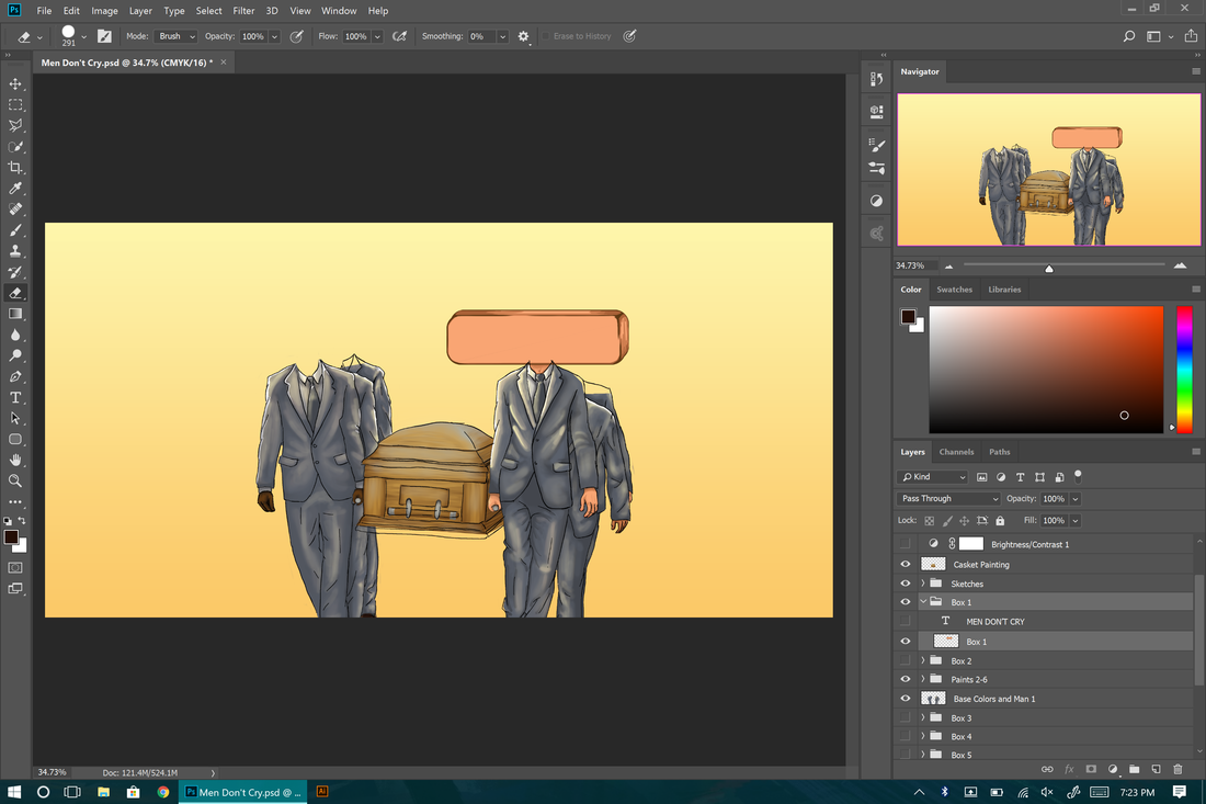
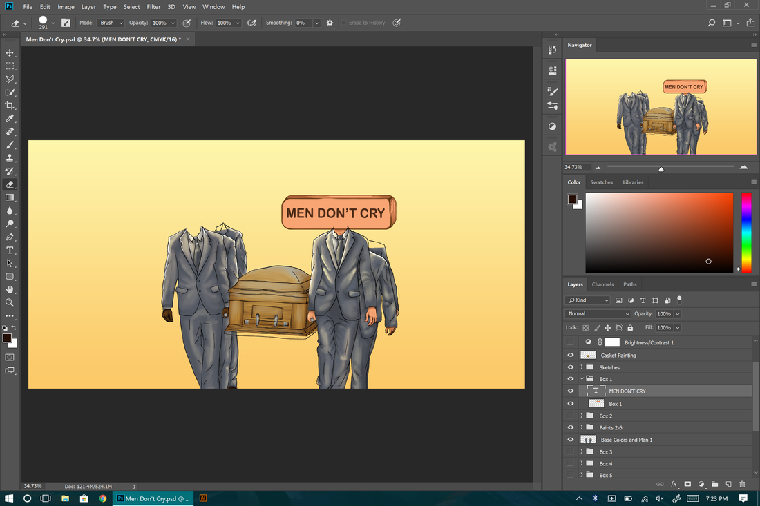
- Adding the Text- Adding the text was not as simple as I thought it would be. I needed to choose a font that plays along with the theme and the image itself. Most of the fonts I had to choose from did match the theme but did not match the box and seem to fit into the picture right, so that was a big factor in choosing and placing the text just right.
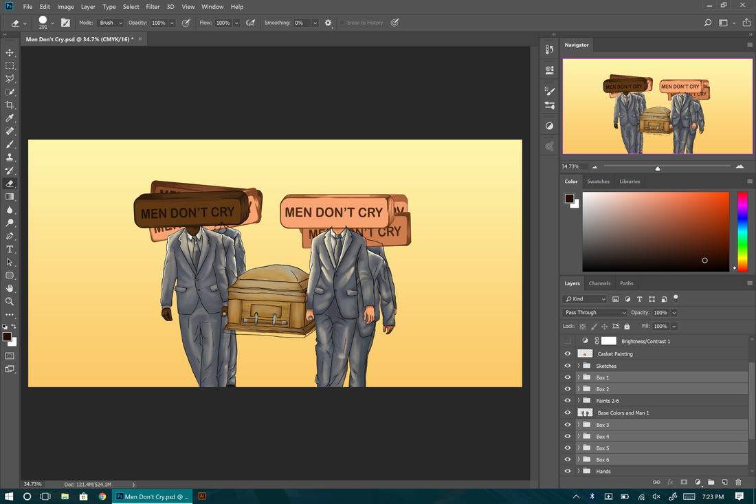
- Repeating Steps 6-7 For Each Man- I then repeated steps 6 and 7 five more times, once for each man. I figured that every man in this image should have the box head so that the message shows over all men and just a few or picked out ones.
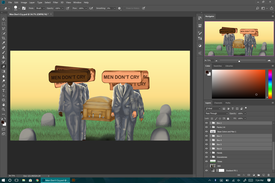
- Adding the Grass- I used a custom brush to the paint the grass with ease. I also added a blur effect with the blur tool to the horizon area of the grass in a somewhat failed attempt to give the illusion of perspective.
- Creating the Scene- In an attempt to create the scene more real and alive I quickly drew out some tombstones and place them in two rows to create a perspective. I feel that this step was poorly done and I decided to play around with some of the settings to make up for what I barely did in this step.
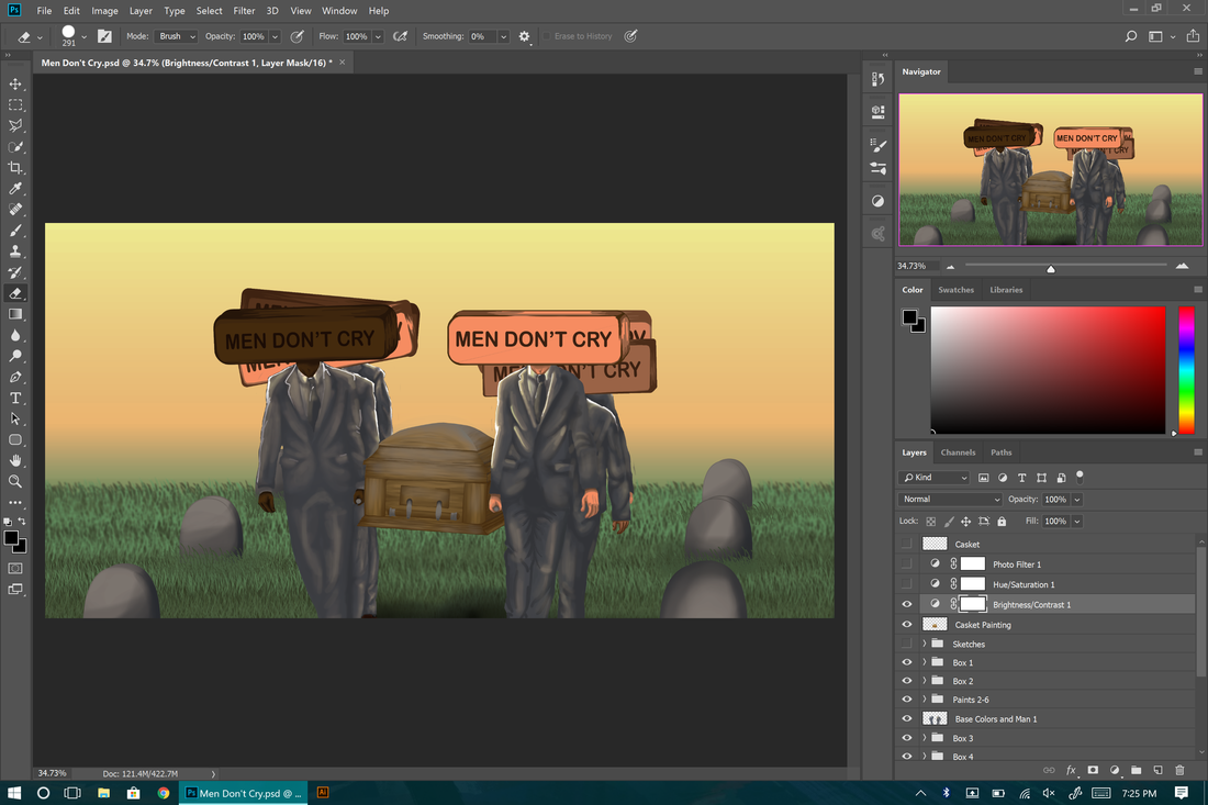
- Lowering the Brightness and Contrast- The image was definitely too bright with too much value to be a scene of sadness or crying, so I lowered the brightness and contrast until I felt the image had a more dull look to it.
- Lowering the Saturation- Adjusting the brightness and contrast still wasn't enough for me because I still felt that the colors popped too much and distracted the viewer from the focal points. I lowered the saturation of the image to fix this problem and give the image more grey undertone.
- Setting the Mood More- The colors still did not represent the mood I wanted even with the grey undertone. I then decided to add a slightly cooler blue to the image to help reach the sad and gloomy tone.
- Finding the Right Composition- Even though this should probably be one of the beginning steps, I waited until the end to worry about this while cropping it down. I used the Rule of Thirds guideline and lined up the boxes on two of the intersecting points because they are my focal points. I also made sure to have the grass line line up with the bottom horizontal line. I am sure that this composition has improved the piece a lot compared to how it was without any purposeful composition.
Reflection
There is a lot in this image that I feel I could improve on if I started over or recreated it. The first big problem is that I feel I could've chose a more sad scene like a man next to his dying mother in the hospital or a soldier holding his dead comrade. I also could have placed more into the scene to make it feel more real and alive. Although the image itself is not something I am proud of, I know I did well with the connection to my inspirational artist. If I were to improve it and make it have more of a connection to Banksy, I would make the image slightly less opaque and digitally edit it onto a building wall or even draw my own building and place it on there.
ACT Connections
- Clearly explain how you are able to identify the cause-effect relationship between your inspiration and its effect upon your artwork. Banksy is widely famous for putting his controversial topics out in the open and with so much emphasis on them, this is exactly what I attempted to do with my piece. You can clearly see the two focal points with the emphasis being their size and placement.
- What is the overall approach the author has regarding the topic of your inspiration? Banksy is definitely not one to hide his opinions and would always use his art to speak out and grab attention from others, this is something I believe strongly creates high quality art. This is what I planned to capture in my piece.
- What kind of generalizations and conclusions have you discovered about people, ideas, cultures, etc. while you researched your inspiration?
- What was the central idea or theme around your inspirational research? I did not particularly have a central idea or theme. Before I started I already knew that I wanted to make something related to Banksy's work. I used his work to think of a topic I could use for my piece.
- What kind of inferences did you make while reading your research?
